
Text field allows users to enter and edit information in an interface.
Overview
Text fields are inputs that accept short-form or long-form content. Text fields are commonly used in forms but can also be included in dialogs or data table. By default they can accept one line of free-form text, but they can be limited to specific types of data:
- Number
- URL
- Phone number
Anatomy

- Label: Explains what information to enter in the text field.
- Hint text (optional): Provides additional help or context about the text field or the information that needs to be input.
- Input: The field that where the user enters the information.
Demo
Open the component in Figma.
When to use
Use a text field in these scenarios:
- When a user needs to input information that isn’t limited to a preset group of options.
- When a user needs to input memorable information that can be entered more quickly manually than making a selection.
When not to use
Don’t use a text field in these scenarios:
- If an input must come from a predefined list of values. Use a select or radio group.
- When building a search field.
Similar components
Variants
Use the variant designed for the amount of information a user needs to know.
Text input
For a single line of text.

Text area
For text that can wrap onto multiple lines.

Inline
For text fields that appear on the same horizontal line as another field. This variant allows hidden labels and the user of placeholder text.

Properties
Text fields can be modified with adornments at the start and end. In LTR languages, that’s the left and right sides. The start may include a text or icon adornment; the end may include a text, icon, or button adornment.
Text adornment
A text adornment is an uneditable prefix or suffix. It pre-populates an already expected section of the input. Examples include:
- A dollar sign at the beginning of a text field that only accepts US currency.
- A company email domain at the end of a text field.

Icon adornment
An icon adornment is a purely visual addition to the input to increase clarity.

An icon can’t be used to perform an action within the input.
Button adornment
A button adornment can perform an action within an input. It should only be used for actions that are limited to the text field. Examples include:
- A button to show or hide a password within a password field.
- A button to clear the contents of a text field.

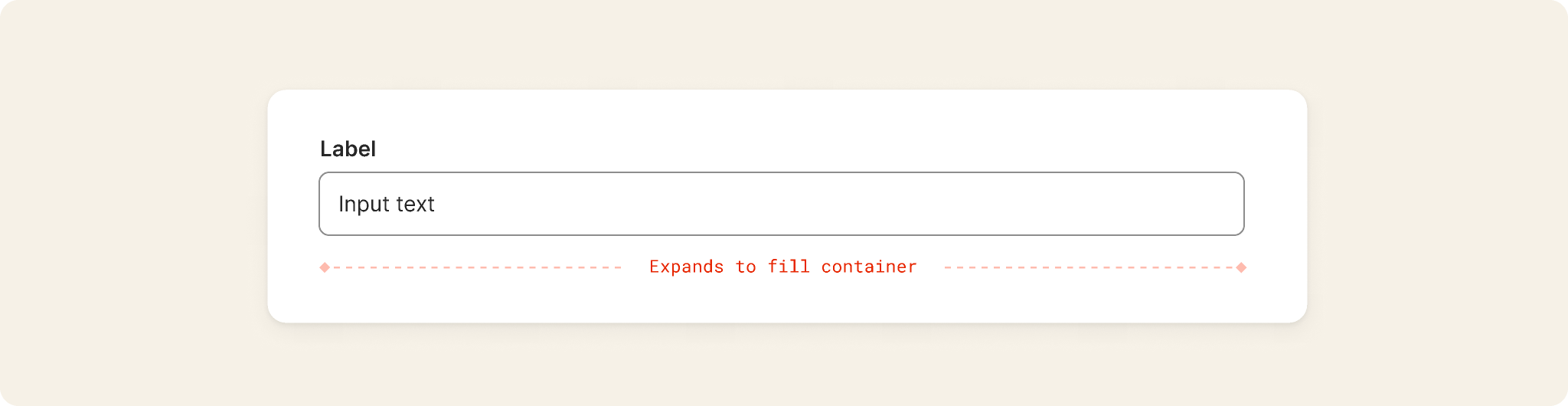
Full width
A full width text field will expand to fill the width of the container.
Behaviors
States
Error
Use inline validation whenever possible.
- If a field doesn’t include an error, the error state shouldn’t trigger while the user is typing.
- If there is an error, an error message should be displayed as soon as the user has finished filling out a field, without the user needing to submit the field.
- If the field has an error displayed, remove the error state once their input is valid — even if the user is still typing.
- Inline errors may include multiple errors. This is most commonly seen with the password variant of text field.
Error messages in Odyssey are displayed under input fields. Errors don’t replace hint text, which appears above the input area.


Disabled
A disabled input is unavailable for interaction and can’t assume focus.
The value of a disabled text field isn’t submitted if it’s in a form.

Read-only
A read-only input can’t be edited, but users can interact with the field to select and copy its content.
The value of a read-only field is submitted if it’s in a form.

Accessibility
Odyssey components are designed and built to meet accessibility requirements out of the box. So, designers and engineers can focus on any accessibility concerns unique to their problem areas.
Our components meet WCAG 2.2 AA criteria and WAI-ARIA guidelines to provide a usable and accessible experience to everyone.
Content guidelines
Text fields should make it easy to understand what information is being requested and how to address any errors.
Label
- A label is the text field’s title.
- The label helps users understand what information to enter into a text input.
- Every text field should have a label.
- The label is always visible.
- Label text should be short and clear — ideally one to five words and never longer than one line of text.
- Labels should typically be nouns. For example, Name not Enter a name.
- In rare cases, if the field is alone on a page and needs clearer instruction, its label could be a call to action. For example, Leave a comment. This is because there’s no surrounding context and using Comment alone could be confusing.
-
Label text should be a statement, not a question.
Questions usually have an acceptable set of answers. If this is your use case, you may want to use checkbox, radio buttons, or a select to allow users to provide their answer. - Use sentence-style capitalization for all labels, except for product names and proper nouns.
- Don’t use colons after label names.
- Text fields are required by default, so optional fields should be marked Optional after the label.
- If using an inline variant, the label can be hidden.
- In Figma, you can either hide the label layer, or use the various Input field subcomponents under Hidden utilities in the UI kit.
Hint text (optional)
-
Use hint text:
- When the text field label doesn’t clearly explain the purpose of the text input.
- To provide guidance or instructions to help the user correctly complete a field. For example, the location of information the user needs to enter in the field.
- To show examples, for example of the correct data format. Don’t use a placeholder to do this because the example will disappear once a user begins to enter information.
- If there’s not enough room to include both instructions and an example, then only include the example.
- To clarify how the information the user enters will be used. - Hint text should be limited to a single line, though multiple lines can be allowed sparingly if there isn’t a concise way to explain the field.
- A link can be included at the end of the hint text.
- Use sentence-style capitalization.
- Write the text as full sentences with punctuation.
- Don’t add hint text only to maintain layout continuity with other inputs that include hint text.
- If the hint text repeats the label, don’t include it.
Error text
Error text tells a user how to fix the error by re-stating the input requirements or describing the necessary interaction.
There are generally three types of error message required for text fields:
- The user didn’t include information that was required. The default format for this kind of error is: Enter {{your/the/a}} {{field label}}, such as Enter your name. or Enter a group.
- The information didn’t pass validation. The text should be actionable and explain to the user what they need to do to proceed. For example: Enter a complete email address, such as you@okta.com.
- The information can’t be saved due to a product error. The text should explain what happened to the user and prompt them to try again. For example: There was a problem {{validating your input/saving your entry}}. Please try again.
Placeholder text
Placeholder text is recessed text that appears in the background of a text field before any user information is entered. Placeholder text an anti-pattern and its use isn’t recommended.
If you have a compelling need for placeholder text, follow these guidelines:
- Don’t use placeholder text to give crucial information or instructions, since it disappears once the user starts inputting information.
- Make sure to provide text to meet content accessibility standards.
- Use sentence-style capitalization.
- Write the text as a direct statement without punctuation.
Content accessibility
- The accessibility label for a text field is typically the same as the label for the text field.
-
For text fields with interactive trailing icons, the accessibility label clarifies the icon’s function.
For example, when a password is hidden, the label for the view icon is Show password, and when the password is visible, the label is Hide password. - If using the inline variant, the purpose of the input with a hidden label must be made clear in some other way contextually. In these cases, consult with the Odyssey team for an accessibility review.
- In code, the label prop is still required. The label will be made accessible to screen reader text.
- An HTML label element will still be rendered but visually hidden.
-
Placeholder text doesn’t meet accessibility guidelines because once a value is entered, placeholder text is no longer viewable.
- If someone is using an automatic form-filler, such as Okta Personal or 1Password, they will never get the information in the placeholder text.
Additional references
- Katie Sherwin (2014, May 11) Placeholders in Form Fields Are Harmful - Nielsen Norman Group